How to create a customer focused mobile app
Last year, I launched with a friend Japan Direct, an itinerary app for Japan travellers. Even if the first version came up quite quickly, I kept iterate but always staying focus on customer feedback first. Almost a year later, it’s good time for synthesis, see what worked and how we created a customer focused app.
Make it work 🛠
When we started as a side project, we separated the work between platforms, I would focus on iOS only for time. In the first iteration, I really wanted to have a simple design but with an optimized UX. I didn’t care about hundreds options, I just wanted users to find best train route in Japan from point to A to B.
Make feedbacks easy 📬
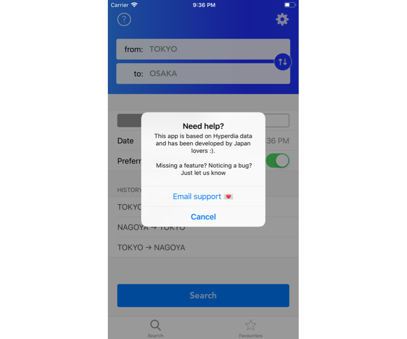
As a mobile user, if there are too many steps to get help, I would probably drop the product. So I assumed my users would do to. That’s why one of the first button was to contact support, aka myself, directly to my personal email address.

This supposed to be almost always available, and since it was rolled out international, I did reply to email in the middle of the night to help people find their way around in many languages.
It wasn’t much about a bug in the app, but sometimes about something unclear: an email to find a station nearby or a journey to a specific hotel. I didn’t care if it was related to the app itself, I often Googled and share the answer with them. It was the best way to collect feedbacks and frustrations.
Make it work (again) 🧰
Let’s be honest here, your app can’t be 100% right from day one. But that was my point, build and iterate fast based on users’ feedback.
This part can be tricky, the bigger the structure, the more process you need, which can take time between releases. But as I was alone on a one feature app, I could fix and resubmit within a day.
That’s also where I created some of my first conversions: turning unhappy feedback into some very supportive one.
Deliver solution, not feature 🎯
At first, I had a list of features I wanted to add to the app, like a list of favorite route, create advanced search or sort per price. It all sounded must have but until I got any feedbacks saying otherwise, I wouldn’t ship it.
So I kept developed feature unreleased: I wasn’t sure I needed to add a solution to a problem nobody seems to have yet. Then comes reviews and requests, and I was able to ship and stay responsive to users feedback.
Iterate until growth 🚀
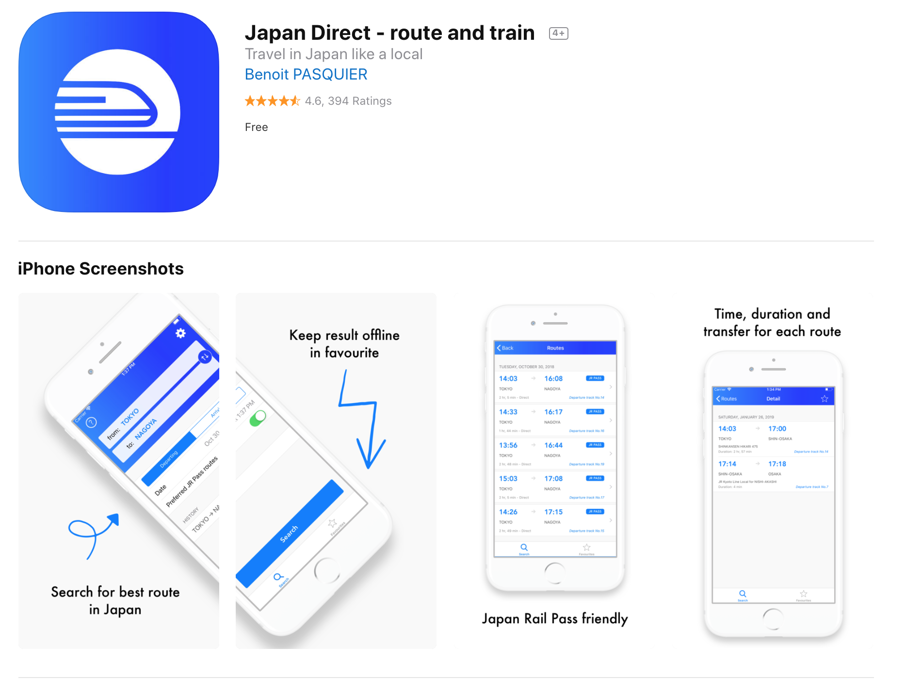
You know you’re doing great when emails you receive are pure love. That was time for me to try to grow and experiment what I learn from growth marketing. I went from building a clean website japandirect.co to redesign App Store screenshots to make the app more attractive.

Following this philosophy all along my journey helped me defined what I wanted to build. With no filter between users and myself, I had to stay focus on building the right product, a simple but useful service that people trust like this user.
“Thank you for doing this app… I guess, this is all I have to say. Amazing work.”
And that’s all what I wanted.
Today, Japan Direct on iOS is over 30 000 downloads and growing, with a solid 4.7 stars rating based on more than 2300 ratings.
Thanks for reading