Adaptive Layout and UICollectionView in Swift
Apple introduced in iOS8 trait variations that let developers create more adaptive design for their mobile apps, reducing code complexity and avoiding duplicated code between devices. But how to take advantage of variations for UICollectionView?
This post will cover how to setup variations via Interface Builder as well but also programatically, using AutoLayout and UITraitVariation with a UICollectionView to create a unique adaptive design.
To create an adaptive design, I’m going to reuse a project that I created with one UICollectionView only. Based on a customised UICollectionViewFlowLayout, the demo app can change its layout, moving from a list, to a grid for instance.
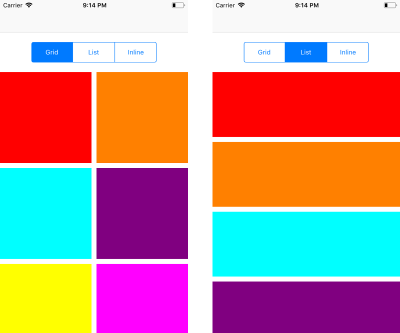
But this app isn’t so adaptive: if we move from portrait to landscape, we have different spacing. Regarding device dimension, it doesn’t make sense to show 2 columns in a grid for iPad the same way for an iPhone.
Let’s see how to fix that and how to create variations foreach dimension
UITraitCollection
Regarding design variations, Apple introduced UITraitCollection, a set of properties defining the iOS interface environment. This includes displayScale for resolution, userInterfaceIdiom for orientation as well as size classes horizontalSizeClass for width of the view and verticalSizeClass for its height. Size classes can take 2 states: compact and regular.
| Devices | First Header | Second Header |
|---|---|---|
| iPad Portrait | Regular | Regular |
| iPad Landscape | Regular | Regular |
| iPhone Portrait | Compact | Regular |
| iPhone Landscape | Compact | Compact |
So far it sounds simple, but don’t forget that iPad can also support split screen which means it’s possible to get a compact width if your app is split on iPad.
Variations in Interface Builder
The easiest way to create variation in your design is definitely through Interface Builder. Note the + on the left of each property of your UI element. Each of those property can support variations.
I chose to hide the UISegmentedControl when the width is compact: the button will only be available on iPad.
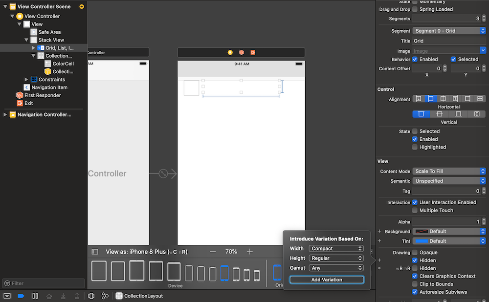
Using variations to show / hide elements that are in a UIStackView is a nice way for instance to reveal extra button options that would be only available to specific screen display.
However, if you check UICollectionView, our layout can’t be updated from Interface Builder.
No problem, let’s go in the code instead.
Variations programmatically
So first, here is what I want to do: I would like my design to be displayed as a list when an iPhone is in portrait mode. However, if in landscape, a grid would make more sense.
However, on iPad, a grid make sense regardless of the orientation: we have some space on a tablet to visualize our elements. Let’s not forget that we can split our app and we would go back to list if we don’t have enough room.
One way would be to detect if it’s an iPhone and iPad and each orientation or dimension, but let’s instead take advantage of size classes with auto layout.
I updated my display enum to take a parameter of number of column in a grid. It’s true that a list is a grid with one column, but let’s keep it for time being.
enum CollectionDisplay {
    case inline
    case list
    case grid(columns: Int)
}
I need to be able to compare that new parameter and will implement Equatable.
extension CollectionDisplay : Equatable {

    public static func == (lhs: CollectionDisplay, rhs: CollectionDisplay) -> Bool {

        switch (lhs, rhs) {
        case (.inline, .inline),
             (.list, .list):
            return true

        case (.grid(let lColumn), .grid(let rColumn)):
            return lColumn == rColumn

        default:
            return false
        }
    }
}
In my custom layout, I’ve also added a container width. The reason is simple: to display a list or a grid, only the width constraint the element to be displayed.
Finally, in case the display type or the container width change, I’ll invalidate the layout.
class CustomCollectionViewFlowLayout : UICollectionViewFlowLayout {

    var display : CollectionDisplay = .list {
        didSet {
            if display != oldValue {
                self.invalidateLayout()
            }
        }
    }

    var containerWidth: CGFloat = 0.0 {
        didSet {
            if containerWidth != oldValue {
                self.invalidateLayout()
            }
        }
    }

    convenience init(display: CollectionDisplay, containerWidth: CGFloat) {
        self.init()

        self.display = display
        self.containerWidth = containerWidth
        self.minimumLineSpacing = 10
        self.minimumInteritemSpacing = 10
        self.configLayout()
    }

    func configLayout() {
        switch display {
        case .inline:
            self.scrollDirection = .horizontal
            self.itemSize = CGSize(width: containerWidth * 0.9, height: 300)

        case .grid(let column):
            self.scrollDirection = .vertical
            let spacing = CGFloat(column - 1) * minimumLineSpacing
            let optimisedWidth = (containerWidth - spacing) / CGFloat(column)
            self.itemSize = CGSize(width: optimisedWidth , height: optimisedWidth) // keep as square

        case .list:
            self.scrollDirection = .vertical
            self.itemSize = CGSize(width: containerWidth, height: 130)
        }
    }

    override func invalidateLayout() {
        super.invalidateLayout()
        self.configLayout()
    }
}
So far, we haven’t made much changes compare to the previous one, we only adapt to those new parameters.
In my UIViewController, I’ll need to detect when a new layout is needed. To do so, I’ll override viewWillLayoutSubviews.
override func viewWillLayoutSubviews() {
    super.viewWillLayoutSubviews()
    self.reloadCollectionViewLayout(self.view.bounds.size.width)
}

private func reloadCollectionViewLayout(_ width: CGFloat) {
    self.collectionViewFlowLayout.containerWidth = width
    self.collectionViewFlowLayout.display = self.view.traitCollection.horizontalSizeClass == .compact && self.view.traitCollection.verticalSizeClass == .regular ? CollectionDisplay.list : CollectionDisplay.grid(columns: 4)

    }
The key is to detect when to invalidate the layout. The method viewWillLayoutSubviews will be the first one to get called in that matter. The view will already have its final size. However, if you check the collectionView, it still has its previous size. That’s why we can do the following:
self.reloadCollectionViewLayout(self.collectionView.bounds.size.width)
On the other side, viewDidLayoutSubviews has the final (and right) size of the collectionView, but it’s too late, the UIViewController already laid out its subviews, including our UICollectionView one.
Here is the result.
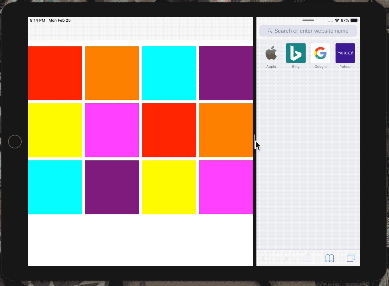
In conclusion, we’ve how to take advantage of UITraitCollection to create an adaptive design for any iOS devices, regardless of screen dimension or orientation.
Trait Variations paired with AutoLayout, we can imaging a suggestion from Apple to design for all platform, including in OSX in the future, if iOS and OSX merge under one operating system.
This code is available here under adaptive-layout branch.
Happy coding