Dos and Don’ts for creating an onboarding journey on iOS
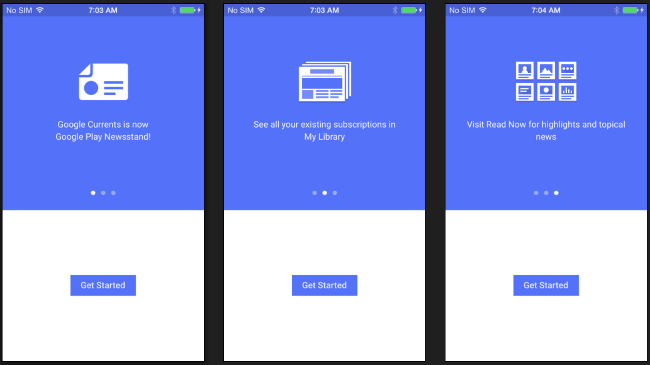
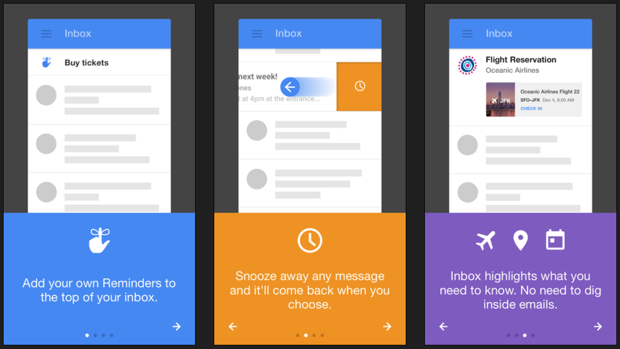
I was recently searching for onboarding journey in iOS, that succession of screens displayed at the first launch of a freshly installed mobile app. But regardless how beautiful the design can be, why so many people are tempted to skip it. I listed things to consider while creating an onboarding journey for your iOS app.
First, what is an onboarding journey and why can it be key to (not) have one? It actually goes back to a user experience problem.
Your users have found your app on the App Store, they downloaded it, and launched it. Amazing. But wait, users don’t use it more than once, your churn is high, your design is complex, the reviews are harsh. Users either don’t understand the app or don’t find the features. That’s where the onboarding comes.

With couple screens, we might want to explain what the user can achieve through the app, where are the features, maybe help him sign up as well. So I created a list to see what suits your needs
Don’t
Don’t create an onboarding journey ”because other apps has one”. If your design is simple and your feature self-explanatory, you shouldn’t create screens to circle buttons to click.
Don’t assume your users is already converted. I’ve discovered many apps asking for email and personal information in onboarding to finish on a pay subscription page. As a mobile user, I still haven’t the value of the app and won’t pay for it.
Don’t do too many steps in your flow. People are busy. Think that any new screen in this onboarding flow is one more reason to drop the app. I believe 3 is balanced, 5 is a maximum.
Don’t overload your onboarding. Picture your user flow like a slide presentation: one idea per screen, keep it short and simple.

Do
Do focus on the solution you deliver, highlight the key values of your app. Designing an e-commerce app? No need to show how a wish-list works, all e-commerce has one. However, show what make your app unique (curated content, etc.).
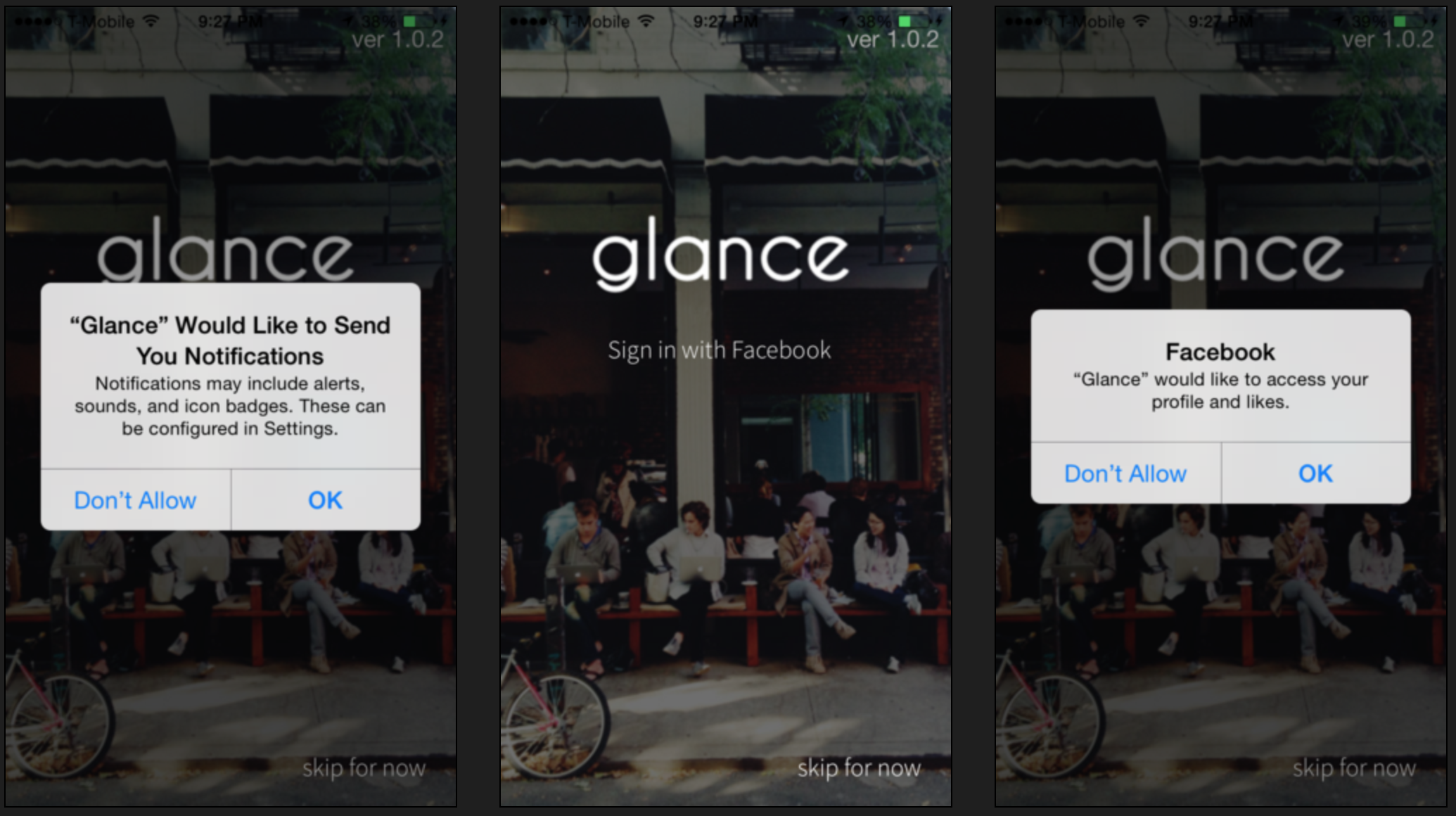
Do respect user’s privacy and explain specific data permissions. At a time where it’s harder and harder to trust big companies with our personal data, I think twice before giving permission for location / notification / camera access. Worse are those one where at the first launch, user is asked for all of them at once without knowing why. It might be good to introduce the service first: ”Want to find best coffee place near you? Share with us your location”.

Do consider your audience and target. If you are designing a mobile game for kids, they are fast learner and often discover by themselves instead of going through tutorials. On the other side, if you develop a Go / Chess app, your users might be older, you maybe want to remind simple moves to show how it works. [chess app]
Do work on the right timing to onboard. You might want to leave the user to go through the onboarding process only once he discovered a bit about the app. It can be a second launch, or maybe after launching a search request. It’s can be nice to let it accessible through an help page if user want to replay it.
Do measure and iterate until you have it right. It can be hard to tweak but since it’s the first journey to your app, it’s decisive to have a great conversion. A/B testing is a great way to help in that matter. I actually created Reversi for that purpose, a light A/B testing framework for iOS written in Swift.
There might more things to consider but I think this is a good base to create a good onboarding. And why not experiencing it by yourself. How many iOS app do you remember having fun while going through their onboarding? Which one was annoying and why?. But I believe the key is to stay customer focused.
Thanks for reading.
Image source: http://uxarchive.com/tasks/onboarding