Create a watchOS app in SwiftUI
Designing a watchOS app in Swift always felt to be quite tricky. I could spend hours tweaking redoing layout and constraints. With SwiftUI supporting watchOS, I wanted to have a new try at it, releasing a standalone app for Apple Watch.
As a regular runner and wearing, and always wearing a watch during exercising, I thought creating a running companion app was a good fit. The design is straightforward: a simple button to “dring” and signal pedestrians of runners.
struct ContentView: View {

    var body: some View {
        Button(action: {
                // todo
            }, label: {
                Text("Dring Dring")
                    .italic()
                    .font(.title)
                    .multilineTextAlignment(.center)
                    .frame(width: 130, height: 130)
                    .foregroundColor(Color("foreground"))
            })
            .buttonStyle(PlainButtonStyle())
            .background(Color("background"))
            .clipShape(Circle())
    }
}
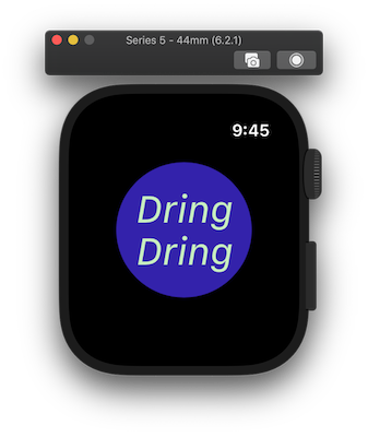
This creates a simple button with an italic text within. Since the screen is quite small and the design is simple, I hardcoded a bigger frame to make it easy to use.

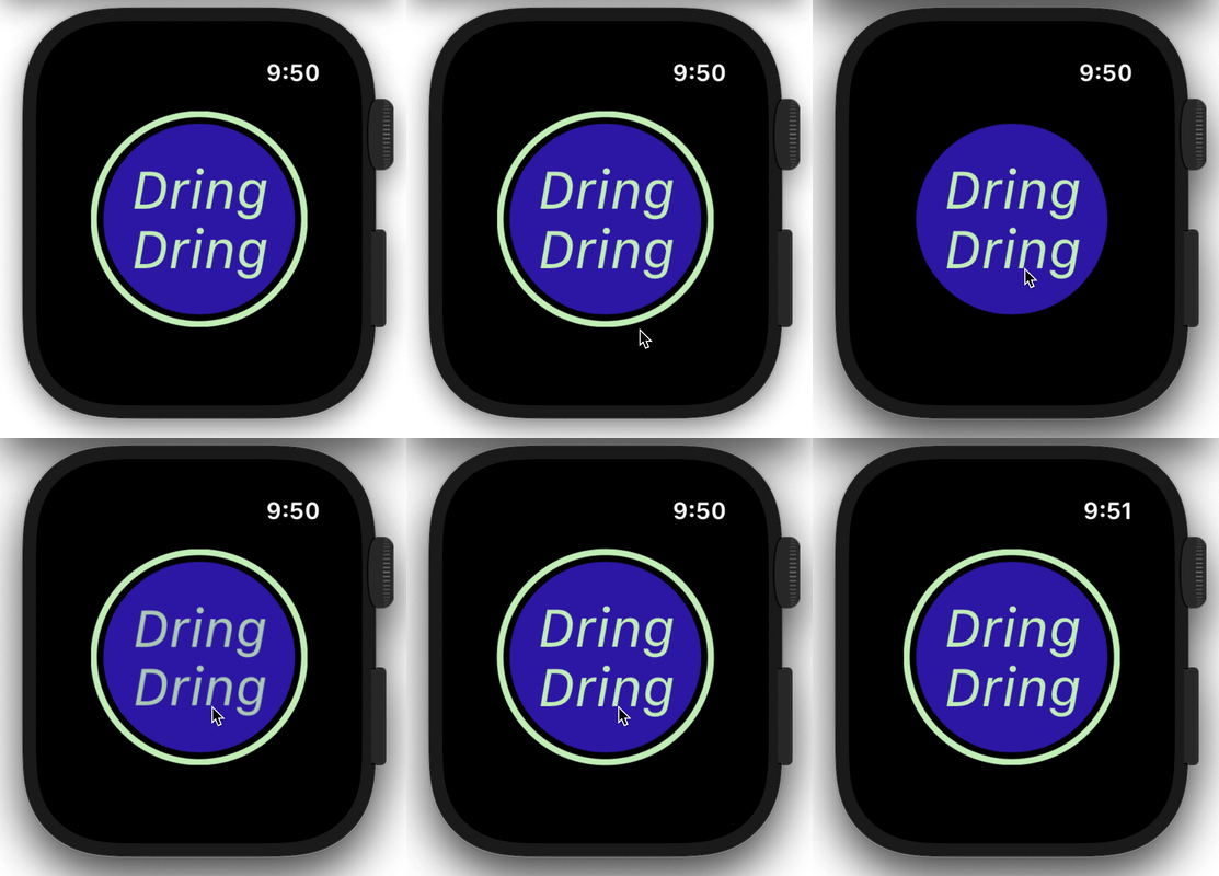
To this, I want to create a border and animate it the user press the button.
If you have experienced SwiftUI in the past, you’ll notice there are many ways to do this. I chose to create a Circle view, using ZStack to place it in the background.
I’m also adding an animation boolean to know when to play it or not.
struct ContentView: View {

    @State var isPlaying: Bool

    var body: some View {

        ZStack {
            Circle()
                .stroke(Color("foreground"), lineWidth: 4)
                .frame(width: 130, height: 130)
                .scaleEffect(self.isPlaying ? 1.3: 1.1)
                .opacity(self.isPlaying ? 0 : 1)
                .animation(
                    self.isPlaying ?
                        Animation.easeInOut(duration: 1)
                    : .default
            )

            Button(action: {
                self.isPlaying.toggle()
            }, label: {
                Text("Dring Dring")
                    .italic()
                    .font(.title)
                    .multilineTextAlignment(.center)
                    .frame(width: 130, height: 130)
                    .foregroundColor(Color("foreground"))
            })
                .buttonStyle(PlainButtonStyle())
                .background(Color("background"))
                .clipShape(Circle())
        }
        .padding(.top)
    }
}
Note that I have also added a .padding(.top), because of the watch navigation area (where the back and settings buttons are often). If it looks fine on Preview and Simulator, it was cropped on physical devices.

If you notice, the animation doesn’t dismiss itself, I’ll need another tap to switch the toggle state and replay the animation backward, but we’ll come back to that.
To be able to play a ringtone on the watch, we’ll need to enable audio capabilities in the target extension under Signing & Capabilities.
From there, I included an free of use ringtone into the project. Since the view needs to observe the playing state, I create a player controller just for it.
class SoundEffectController: NSObject, ObservableObject, AVAudioPlayerDelegate {

    let player: AVAudioPlayer

    @Published
    var isPlaying: Bool = false


    func play() {
        player.delegate = self
        player.play()
        isPlaying = true
    }

    func pause() {
        player.pause()
        isPlaying = false
    }

    func stop() {
        player.stop()
        player.currentTime = 0
        isPlaying = false
    }

    func audioPlayerDidFinishPlaying(_ player: AVAudioPlayer, successfully flag: Bool) {
        self.stop()
    }
}
The controller will switch the toggle for us by its delegation when the player starts and stop.
To keep things a bit cleaner, I also created a view model to put some distance between the player controller and the view.
class SoundEffectModel: ObservableObject {

    let effect = SoundEffect(soundName: "dring")

    var playerController: SoundEffectController? {
        didSet {
            cancellable = playerController?.$isPlaying
                .receive(on: DispatchQueue.main)
                .assign(to: \.isPlaying, on: self)
        }
    }
    var filePlaying: String?
    var cancellable: AnyCancellable?

    @Published var isPlaying = false

    //...
}
This is the key part of the binding system. When creating a player, I bind it’s playing state to the viewModel one, so it can reflect on the view itself.
The last step is to bind the element back to the view.
struct ContentView: View {

    @ObservedObject var model: SoundEffectModel

    var body: some View {

        ZStack {
            Circle()
                .stroke(Color("foreground"), lineWidth: 4)
                .frame(width: 130, height: 130)
                .scaleEffect(self.model.isPlaying ? 1.3: 1.1)
                .opacity(self.model.isPlaying ? 0 : 1)
                .animation(
                    self.model.isPlaying ?
                        Animation.easeInOut(duration: 1)
                    : .default
            )

            Button(action: {
                self.model.startPlaying()
            }, label: {
                Text("Dring Dring")
                    .italic()
                    .font(.title)
                    .multilineTextAlignment(.center)
                    .frame(width: 130, height: 130)
                    .foregroundColor(Color("foreground"))
            })
                .buttonStyle(PlainButtonStyle())
                .background(Color("background"))
                .clipShape(Circle())
        }
        .padding(.top)
    }
}
And that it.
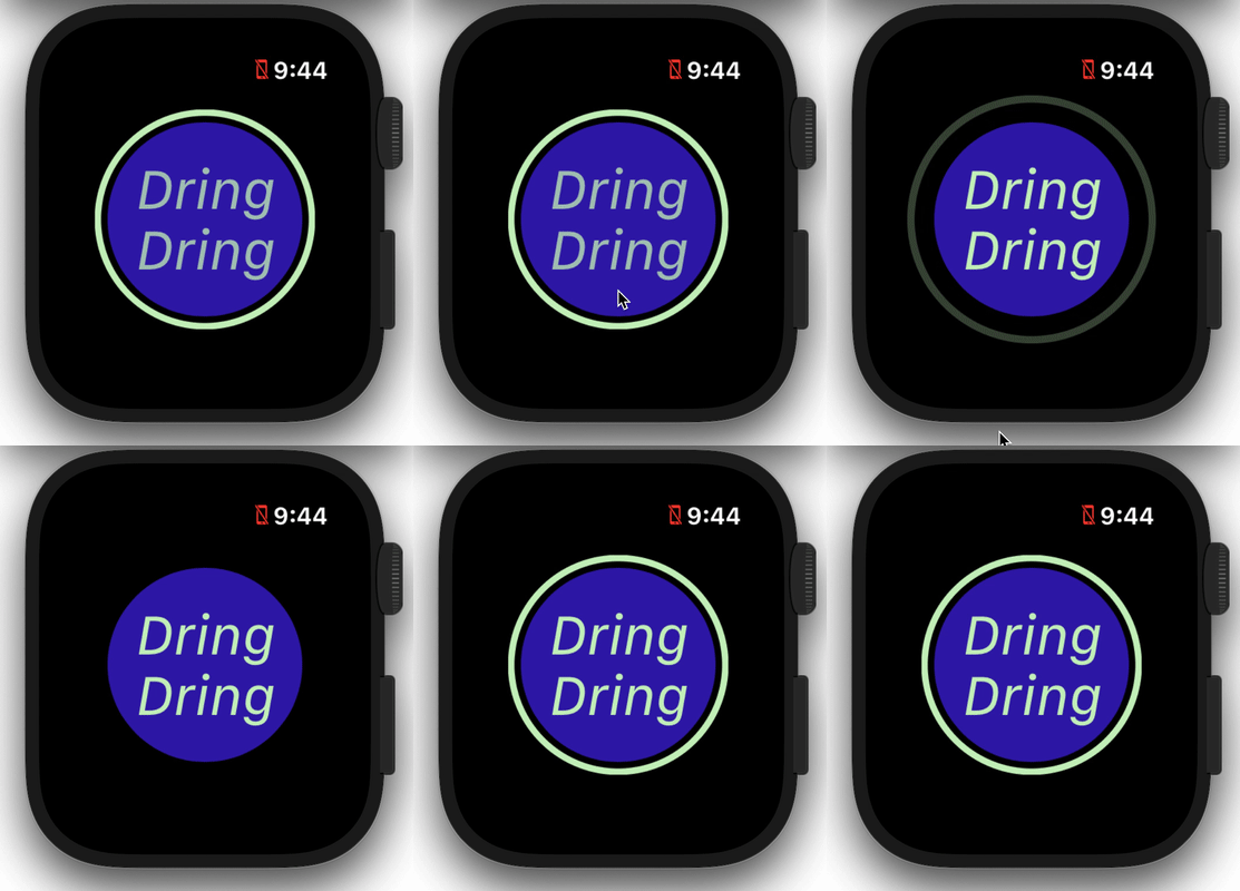
When we start playing, the player state will switch and animate the view. When the player stops at the end of the ringtone (about 1 or 2sec), the switch is back off and reverses the animation.

If you’re interested to submit your standalone watchOS app, the process is the same as an iOS app including a demo video to show the behavior of a physical device. Although, there is almost no documentation for submitting a standalone app.
For this really simple app, the work stops there, but I need to highlight some of SwiftUI components that are not available on watchOS, NavigationView being one which limited my scope.
In conclusion, we saw how to build a standalone watchOS app from scratch using only SwiftUI. If SwiftUI brings a lot to the iOS development, I believe now more than ever that its cross-platform support between iOS, macOS, watchOS, and tvOS makes it a really great tool for developers.
Thanks for reading